

When looking for a good logo design, most business owners think it just has to “look good.” What they fail to understand is the psychology behind an effective logo. By keeping simple branding principles in mind, anyone can arrive at a killer logo that looks good and communicates their brand message in a unique and powerful way.
What is the Purpose of a Good Logo Design?
Why are logos so important? What is their purpose? What would you like your logo to achieve for your business? Surely, you’re not about to invest in a logo just because it’s the thing to do, right?
So what’s the goal?
Before getting into the best logo design tips, it pays to understand what you’re trying to accomplish. Essentially, the purpose of a good logo is to communicate something to your potential customers on a subconscious level. A logo is a calling card of sorts, capturing something unique about your corporate identity and value. And this message should be basic and easily connect your audience to your core brand. Basically, a good logo design is an attractive and meaningful face on your business.
What Makes a Good Logo?
 So what is the best way to accomplish these goals? What makes a good logo design? What are some logo design tips to ensure your logo effectively communicates your message and brand identity?
There are several key ingredients to rely on when learning how to design a logo. And the following list will walk you through the basics and most important elements of a good logo design.
- Memorability
An effective logo is easy to recall. Think about it. What does Pepsi’s logo look like? Apple’s logo? You can instantly recall them. Why? Because they walk a fine line between simplicity and detail. A good logo design will be simple enough to commit to memory without trying, yet have enough detail to associate with your brand. - Versatility
This one is easily overlooked. If you want to learn how to design a logo, don’t forget that your company name will likely be a part of the overall design. Do the two elements – typically called a lockup – look good together? Most importantly, will this design translate to a brochure? A website? An ink pen? Business card? Your logo should be versatile enough to look right in many settings. - Proper Message
How can a simple graphic communicate your brand message? This is where working with a professional graphic design firm comes in handy. You can’t fit everything about your business into a logo, but you can emphasize a key value or two. Consider Apple’s logo, which communicates that the company values simplicity, functionality, and artistry. - Proper Colors


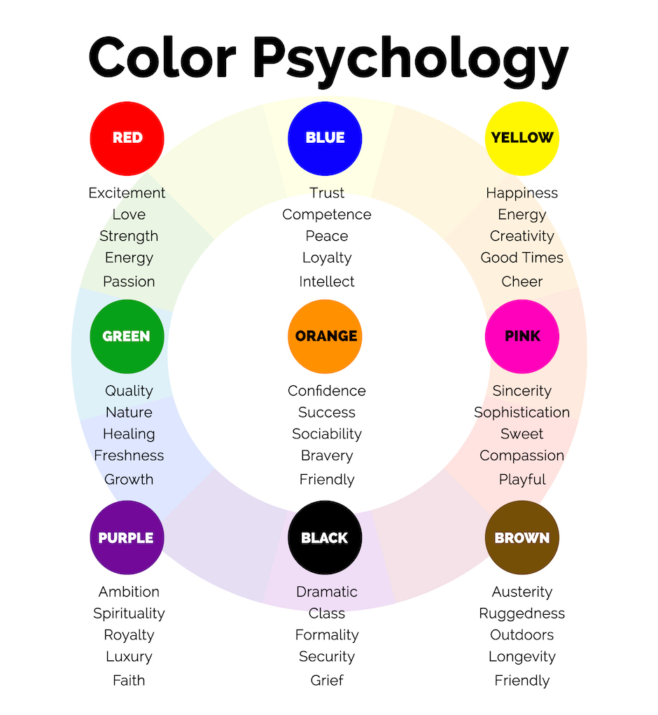
CREDIT: Faith Branding
A good logo design will only incorporate a few colors at most. Some do well with only one color. But which color to choose? Believe it or not, colors subconsciously tell the viewer about your business. Indeed, the colors used in your logo have a psychological effect and are part of the message! For example, blue communicates trust and credibility, while brown communicates longevity and ruggedness.
- Aesthetics
Yes, your logo should look good. This is one of the important ingredients every logo should incorporate. If it doesn’t come off as visually appealing, it won’t matter if you get the other elements right. - Timelessness
A good logo design is fresh and current, yet not trendy. If your logo contains elements hot today, it will look outdated tomorrow. So play it safe and utilize symbols or images that will retain relevance. - Simplicity
This is possibly the most important ingredient. Less is best, so keep it simple. A simple logo will be more easily remembered, more easily scaled to smaller applications, and more broadly interpreted to encompass more meaning. While it may sound counter-intuitive, sometimes, the less there is to your logo design, the more it can say! - The Right Vibe
If your company is edgy, an edgy look is called for to communicate the right vibe. But if you cater to professionals in their 50s and 60s, for example, you might want to tone it down. So take your audience into consideration, and communicate this vibe in your logo design.


Making a Good Logo Design Work
Incorporating these key ingredients will ensure a great face for your brand and build brand trust, loyalty, and understanding for years to come. Remember, when discussing your logo design with a graphic designer, it’s best to discuss values, themes, and feelings you wish to convey to your audience. Leave them to translate these messages into graphic form.
A good logo design will work best and be a success if it is simple, yet memorable, and fresh, yet timeless. It will give your customers an intuitive snapshot of what it’s like to do business with you, leaving a lasting impression and building brand awareness, trust, and loyalty.
